SKYFALL
| |||||||||||||||||||||||||||
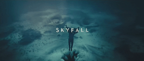
Titles used in the title sequence mostly overlaps the image behind it. colours mostly contrast to make the title clear for the audience. Without the contrast the titles wouldn't be clear therefore unattractive to viewer: This would make the expectation of movie decrease and be seen as a film which isn't good quality. The audiences perspective is very important therefore the film would be based around the viewers likings. |
No comments:
Post a Comment