Kyle Copper thinks that a good title sequence is accomplished by setting an expectation and having type to add impression of the film.
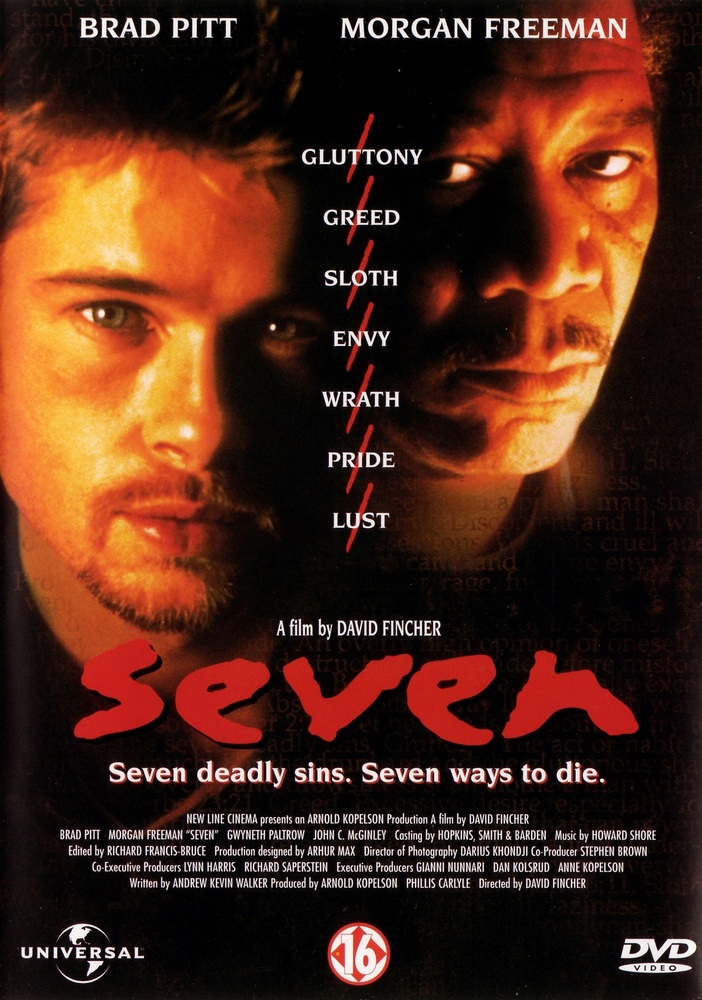
 The font used in the film 'Seven' is important because the typography match the plot of the film and make the type do what the film says so as it is a serial killer film, the font is dark and bold.
Cooper likes 'Deadzone' because it has simple typography and the music is played out overtime. He also likes 'To Kill a Mocking Bird' because it clearly shows the main characters obsession, the type is horizontal which goes with the background and the marbles are distorted which are beautifully photographed.
A 'story-based' main title sequence is when there is a specific back story, clear metaphor and the poster is like a pun of what the film is about.
 The main problems the studio face when doing an audience test screening is there may not be enough of a budget to make another scene and the test audience doesn't understand a certain aspect of the film so they have to be told.
The two and a half minutes of the title sequence becomes important to the studio because it can become another scene for the movie, help put in information that got left out and it can become a prologue.
The title sequences of 'Dawn of the Dead' try to advance the thought and set the screening and then a dark ending.
Cooper thinks that title sequences are important to a film because they can help the movie tell a back story.
No comments:
Post a Comment